I'm Kacem Boumehdi, a Senior Product Designer who designs AI products and builds them with AI.
8+ years turning complex systems into clear products, from digital transformation and e-government platforms to telecom services and products I design and build myself.
42 screens validated across mobile, fixed line and internet
Designed by me · Released 2023
MyWarranty
Keeps warranties, receipts and expiring documents in one place, scans receipts on the phone and sends a reminder 30, 7 and 1 day before a date runs out.
Platforms I designed at Netopia Solutions and before. Most are under NDA, so I walk through them in conversation.
ANRAC
Ministry of the InteriorPublic agency platform2022
Registre social unifié
Ministry of the InteriorNational social registry2021–2022
ANCFCC
L’Agence nationale de la conservation foncière, du cadastre et de la cartographieLand registry platform2021
Maroc Telecom Zéro Défaut
Maroc TelecomQuality program2021
Les Imperials
Imperium MediaEvent & digital experience2019
About me
Designing digital products that make complex things feel simple.
I'm Kacem Boumehdi, a Senior Product Designer.
I work at the intersection of product thinking, user experience and visual design, transforming complex requirements into intuitive and useful digital experiences.
Throughout my work, I've contributed to products across government, telecom, fintech and independent product development.
I enjoy understanding how people work, identifying problems and designing solutions that balance user needs, business objectives and technical constraints.
What I do
Four ways I help a product team.
01
Product design
I turn ideas and business requirements into clear product experiences. From understanding the problem to defining the product structure, I focus on creating solutions that are useful, practical and aligned with real user needs.
02
UX strategy
I organize complex information into understandable experiences through user journeys, information architecture, wireframes and interaction design.
03
UI design
I translate product requirements into polished interfaces through visual hierarchy, typography, component systems, responsive layouts and consistent design patterns.
04
AI-assisted product development
I use AI tools to explore ideas, accelerate prototyping and support the development of digital products, helping bridge the gap between design concepts and working experiences.
My design process
From a fuzzy problem to a product that ships.
01
Understand
Research the problem, understand requirements, identify constraints and learn about the people who will use the product.
02
Structure
Define information architecture, organize user journeys, create wireframes and establish the interaction logic.
03
Design
Develop the visual language, interface components, design system and prototypes.
04
Deliver & iterate
Collaborate with developers and stakeholders, validate design decisions, incorporate feedback and improve the product through iteration.
Experience
8 years and 3 months of UX/UI and product design.
May 2024 – Present
Freelance, international
Senior Product Designer · AI
Co-founder. Designed and built GIA, an AI app builder that turns a prompt into a working app. MyWarranty, a mobile app: product framing, user journeys, Figma prototypes and developer handoff.
Mar 2021 – Feb 2024
Netopia Solutions
Senior UX/UI Consultant
Moroccan technology company for e-government, digital identity, e-health and cybersecurity. netopia.ma↗
Led UX/UI design for strategic platforms (Ministry of the Interior, Maroc Telecom, ANCFCC, RSU), from user research to final delivery. Ran co-design workshops with product, development and project teams, built wireframes and high-fidelity prototypes, redesigned public portals (ANRAC, ANCFCC, RSU) and designed back-office tools such as a citizen requests CRM for the Ministry of the Interior.
Dec 2019 – Jul 2020
BrainTest Inc.
Lead UX/UI Designer
BrainTest Inc., the company behind the BrainTest app, an at-home digital test for early signs of memory decline, focused on the US market. braintest.com↗
Designed conversion-focused landing pages for the BrainTest app, targeting the US market. Worked with the traffic managers and the marketing team, and led the developers who built the pages.
Jan 2018 – Dec 2019
3W Media
UX/UI Designer
Casablanca agency for communication, IT services and software development. 3wmedia.ma↗
Designed interfaces and user experiences for websites, mobile apps and platforms for varied clients, from brief to developer handoff. Contributed to the design of the Les Impériales mobile app for a national event.
Tools
UX/UI design
Figma
Adobe XD
Visual design
Adobe Photoshop
Adobe Illustrator
AI-assisted workflows
ChatGPT
Claude
DeepSeek
Codex
For exploring ideas and prototyping faster. The design decisions stay mine.
Education
Graphic Design and Visual Communication
ENSA · 2023
Licence universitaire spécialisée, Infographie & Communication Visuelle
Diploma
MIAGE · 2020
Diplôme de Technicien Spécialisé, Développement Informatique
Languages
Arabic native
English professional
French professional
Good design is not only about how things look. It's about making things work better for the people who use them.
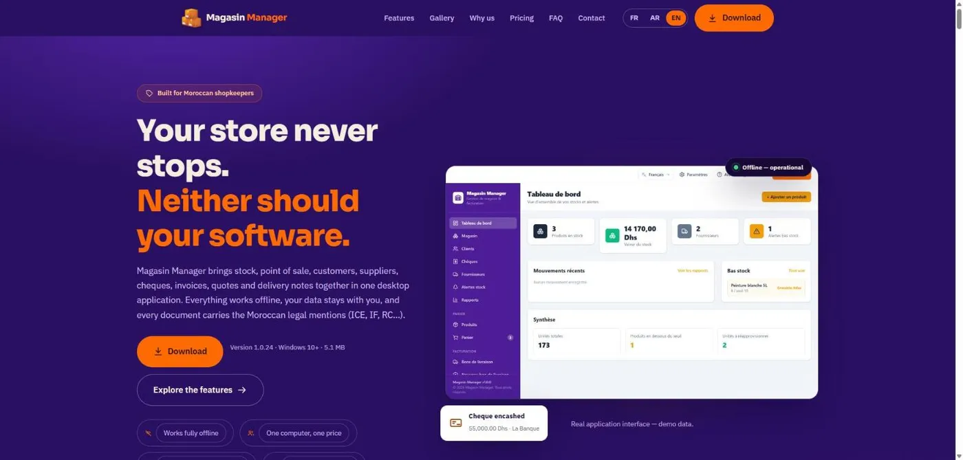
A shop that runs on cheques and notebooks, redesigned to work without the internet.
Stock, counter sales, customer credit and post-dated cheques for small Moroccan shops, in French, Arabic and English. Every daily task works with no connection at all.
My role
UI/UX & product designer, from the first shop visit to release
How it was built
Designed by me; coded by AI coding agents from my direction, reviews and bug reports
Timeline
7 weeks to v1.0.24
Platform
Windows desktop, plus a read-only phone view
Result
30+ paying users before the public website launched
Magasin Manager · Tableau de bord
The dashboard on the shop’s PC, and the read-only view the owner checks from his phone. Demo data.
01 · The problem
The business runs on trust, credit and paper.
Small supplies and hardware shops sell on credit to regular customers and take cheques dated weeks ahead, as payment or as a guarantee. Debts live in notebooks; cheques live in folders. The shop I started from had tried an online stock app: when the town’s connection dropped, it couldn’t record a sale, and it wouldn’t export the owner’s own data.
How might we
…give a small shop a complete, trustworthy picture of its stock, its customers’ debts and its cheques, using the vocabulary and payment habits it already has, without depending on the internet?
“Where is this customer’s cheque?”Guarantee cheques were returned, cashed or handed to suppliers, and nothing recorded where each one went.
Forgotten due datesWhat each customer owed, and when, was written down. Nothing reminded anyone.
No network, no workThe online app stopped every operation the moment the connection dropped.
Data he didn’t controlHe couldn’t export his own records, so trying a tool meant handing it the business.
02 · The solution
Built around how these shops actually trade.
Chèques
Cheques as a schedule. Each cheque has a due date, a status and a record of where it went: a supplier, the bank, or back to the customer. The owner sees the cash that is coming, month by month, and can finally answer “where is my cheque?”.
Client · compte
A customer notebook, not a table. One page per customer, like the notebook it replaces: what they bought, paid and still owe (cheques included), their advance, and a timeline of every operation.
Bon de livraison
One delivery note moves everything. Handing over goods deducts stock, posts the sale to the customer and uses their advance, then becomes an invoice in one click, printed in the French format accountants already trust.
0
internet needed for any daily task
Offline, trilingual, owned by the shop. The data lives on the shop’s PC, with visible backups to USB. Every screen works in French, Arabic (right-to-left) or English, and the owner can check the shop from his phone on the same Wi-Fi.
03 · The product thinking
The hard part wasn’t the screens.
Four decisions did most of the work. Each one started from something I saw in the shop.
Data model
Challenge
Sales made through delivery notes never reached the customer’s balance, so credit, stock and returns drifted apart.
Decision
I mapped the business before any screen and put the delivery note, not the invoice, at the centre: it moves stock, creates the debt and gets paid by cash, cheques or advance.
Benefit
Balances stay correct whatever mix of cash, cheques and advance a customer uses.
Navigation
Challenge
Fifteen destinations in one flat sidebar.
Decision
Three groups that follow the working day: monitor & manage, sell, document. Settings, help and language moved to a top bar; detail pages open in context.
Benefit
Staff find things by what they are doing: a counter sale is about seven clicks, a sale from a customer’s page two.
Error prevention
Challenge
In business software, most bugs come from records changing state silently.
Decision
Every record got explicit states, one colour and one label each, used everywhere. Entries created by a delivery note are locked; overpaying is capped and moved into the advance.
Benefit
No negative debts, no stock deducted twice, and numbers the owner can trust.
PendingCashedRejectedOverdue
Trust
Challenge
The online app the owner had tried wouldn’t even let him export his own records.
Decision
When a trial or licence ends, the app goes read-only, never locked. And invoices stay in French, the legal language, whatever the screen language.
Benefit
Shops can commit without fear of losing their records, and their paperwork stays valid.
04 · The outcome
Adopted before it was marketed.
30+paying users before the public website launched, through direct recommendation
25signed releases in 22 days, small and frequent, driven by what real use exposed
1shop owner who replaced his notebooks with the app, and still takes cheques, now tracked
What was delivered
A trilingual, offline-first desktop app covering stock, counter sales, customer credit and advances, post-dated cheques, delivery notes, invoices, quotes and returns, with signed self-updating installers and a read-only phone view.
What I did
Field observation in the shop about twice a week, the domain model, information architecture, flows, state rules, the interface and its three languages, the product scope and pricing deals with the first shops, and directing the AI agents that wrote the code: testing every build, triaging reports, shipping every release.
The hardest design question in this project was “what is a cheque?”. Getting that right mattered more than any screen.
Read the full case study ↓Research, domain model, states, six decisions, edge cases, what broke, the design system and reflection.
The full case study
Where it started
One shop, one missing cheque
I met the owner of a farming-supplies and irrigation shop in a small town. More than five people work there. Every customer debt, and the date it was due, lived in paper notebooks. Cheques lived in boxes and folders.
In Morocco a cheque is not only a payment. Customers often leave one as a guarantee, then come back later with the full amount in cash to take it back. The owner might also have passed that same cheque to a supplier to pay for merchandise. So when a customer arrived to collect his cheque, the shop had to search for paper that might not even be in the building any more.
I asked him why he didn't use a stock management app. He had tried one. It was online-only, and in his town the connection is slow or simply absent, so when the network dropped he couldn't record a sale or look anything up. He also couldn't export his own data out of it.
Not a missing feature, a mismatch: the tools assumed a connection, card payments and someone else's paperwork.
1
“Where is this customer's cheque?”
Guarantee cheques were returned, cashed or handed to suppliers, and nothing recorded where each one went.
2
Forgotten due dates
What each customer owed and when they had to pay was written down, but nothing reminded anyone.
3
No network, no work
The online app he tried stopped every operation the moment the connection dropped.
4
Data he didn't control
He couldn't export his own records, so trying a tool meant handing it the business.
Problem and context
The real business runs on trust, credit and paper
A typical supplies or hardware shop sells on credit to regular customers, takes cheques dated weeks ahead, hands over a bon de livraison (delivery note) with the goods, and invoices later. None of that fits a retail point-of-sale built around “scan, pay by card, print a receipt”.
Shop owner
Wants the health of the business at a glance: stock value, who owes what, which cheques are due and where they are.
Counter staff
Needs to serve a customer fast and hand over a clean document, with no mental arithmetic.
Bookkeeper
Needs documents with the right legal identifiers, and a history that can be trusted.
The shop itself
An unreliable connection, a modest PC, and data that must survive that PC.
How might we
…give a small shop a complete, trustworthy picture of its stock, its customers' debts and its cheques, using the vocabulary and payment habits it already has, without depending on the internet?
Goals
Every daily task works fully offline.
Customer balances are always correct, whatever mix of cash, cheques and advances is used.
Documents match the paperwork customers and accountants already expect.
Arabic is a first-class language, not a translation layer.
The shop always owns its data, and losing the PC never means losing the business.
Non-goals
Real-time multi-device sync: one PC is the source of truth; phones get a read-only view.
Card payments or an online store.
A full accounting ledger: the app produces clean inputs for the accountant instead.
Design principles
Five rules to settle every debate
01
Offline is normal
No core flow depends on the network. “No connection” is never an error state.
02
One primary action
Each screen has one dominant warm button. Everything else is secondary.
03
Type less
Defaults, pickers, auto-numbering, and live totals, VAT and discounts.
04
Always answer back
Every action gets immediate feedback: a toast, a state change or a confirmation.
05
Protect the data
Destructive actions confirm first; backups are visible and in the user's hands.
Domain model
The delivery note, not the invoice, is the centre of the shop
Before laying out screens I mapped the business objects and how they relate. In these shops the delivery note is what moves stock, creates debt, and gets signed by the customer. Invoices, returns and payments all hang off it, so I designed around it.
Customer
Holds total bought, paid, remaining due and an advance. The note posts the sale to this account.
Product
SKU, quantity, low-stock threshold, buy and sell price. The note deducts stock.
Cheque
Amount, due date, status, partial payments, and where it went. Settles the customer's debt over time.
Invoice · Quote
Lines, discount, TVA, status. An invoice is created from a delivered note, without deducting stock twice.
Delivery note
Deducts stock
Posts the sale to the customer
Uses the customer's advance
Becomes an invoice in one click
Return
Reason, settlement and restock per line. References the original note.
Supplier
Provides products, and can receive a cheque the shop passes on.
Information architecture
Three groups that follow the working day
Instead of a flat list of fifteen destinations, the sidebar is grouped by intent: monitor & manage, sell, then document. Settings, help and language sit in a separate top bar so they never compete with the work. Detail pages open in context and are never added to the sidebar.
Click counts are counted from the shipped build, not measured with users. Defaults (today's date, “pending” status, auto-numbered documents) keep the forms short.
State design
Every record has a clear lifecycle
Most bugs in business software come from records changing state silently. I defined each object's states and what every transition does to stock and money, then gave each state one colour and one label, used everywhere.
Delivery note
drives stock and credit
Draft→Delivered→Invoiced
Delivered deducts stock and posts the sale to the customer. Invoiced links an invoice without deducting twice. Reverting to draft or deleting reverses stock, advance and balance.
Cheque
money that isn't money yet
Pending→CashedorRejected· flag:Overdue
A pending cheque past its due date is flagged overdue and triggers a reminder. Partial payments that cover the amount switch it to cashed automatically.
Invoice
Draft→Pending→PaidorOverdue
Quote
Draft→Pending→AcceptedorRefused
App access
licence
7-day trial→LicensedorRead-only
When the trial or a licence ends, the app becomes read-only rather than locked: the shop always keeps access to its own data.
Key design decisions
Six decisions that shaped the product
01
Cheques are a schedule, not a payment method
This came straight from the missing-cheque problem. A post-dated cheque has a future due date, can bounce, and is often passed to a supplier or kept as a guarantee. Logging it as “paid” would hide the shop's real cash position, and wouldn't say where the paper is. So cheques got their own module.
A payment delay on each cheque; the due date is calculated.
Grouped by due month, with totals, pending amount and overdue count per month.
Every cheque records where it went: a supplier, or reserved recipients like “La Banque”, “Garantie !” and “Retourné au client”.
An overdue reminder repeats until someone handles the cheque.
Trade-offOne more module in the navigation, in exchange for a cash forecast the owner can rely on, and an answer to “where is my cheque?”
Chèques
Cheques grouped by due date, with totals by status.
02
From a customer table to a customer notebook
The owner thought about customers the way his notebooks worked: one page per person. The first version was a table with a side drawer, and sales made through delivery notes never reached the customer's balance. I replaced it with a card for every customer that opens into a full page: the whole relationship with the shop in one place, built around four honest numbers.
Total bought · Paid · Remaining due (cheques included) · Available advance.
Purchases, payments, cheques and advance movements on the same page.
A timeline shows every operation since the customer was registered.
Overpaying asks for confirmation, caps the payment and moves the excess into the advance. No negative debts.
Entries created by a delivery note are locked; manual ones stay editable and recalculate the totals.
Trade-offA table is faster to scan, but a page per customer holds the whole relationship and can be linked to from anywhere, like the notebook it replaces.
Client · compte
The customer page, built around four numbers, with the advance ledger.
03
Arabic as a first-class language, without breaking money
Switching to Arabic mirrors the whole interface right-to-left and loads a bundled Arabic typeface (Cairo), so it works offline. The subtle problem was numbers inside right-to-left text: amounts reordered and read wrong.
Every amount, quantity and date is now isolated as a left-to-right unit with Latin digits. Phone, email and ICE fields stay left-to-right inside Arabic forms, and directional icons mirror.
Trade-offPrinted documents deliberately stay in French, left-to-right, whatever the screen language, because that's what customers, accountants and the tax administration expect on paper.
✕ Before
المبلغ: Dhs 13 000,00
✓ After
المبلغ: 13 000,00 Dhs
Same string, same Arabic sentence. Only the isolation of the amount changes. (Live text, not an image.)
04
Documents that look like the paperwork shops already trust
Delivery notes, invoices and quotes follow the layout Moroccan businesses recognise and the legal identifiers official paperwork carries. They are printed in French because that is the language of the legal document.
ICEIFRCPatenteCNSSTVARIB
Company block with logo, address, legal form and capital.
Line items, fixed or % discount, TVA, Total HT and Total TTC.
The closing line “Arrêté le présent bon de livraison à la somme de…”, payment terms and signature boxes.
A dedicated A4 print stylesheet hides the app around the document.
Trade-offA fixed, conventional layout instead of a template editor. Less flexible, but correct by default with nothing to configure.
Bon de livraison · BL-2026-003
Printable delivery note with a one-click “Create invoice”.
05
Data safety the user can see
The previous app held his data hostage. Here, every change is written instantly to a local database in the user's profile, so updates and reinstalls never touch it, and protection is visible and in the user's hands.
Autosave to a plain “Backup” folder in Documents.
USB backup: plug in a drive and the app offers to back up; approved drives are recognised even if the drive letter changes.
Import merges, never overwrites, and reports what was added and skipped.
Forgotten password? Prove ownership with a backup you exported yourself. No support call.
A read-only phone view over the shop's Wi-Fi, via QR code and optional PIN.
Trade-offNo real-time cloud sync. A single local source of truth is simpler to trust and works with no connection at all.
Read-only phone view over local Wi-Fi.
06
A business model that fits how the market paysTrust
When a licence ends, the shop keeps its data. Every record stays visible and readable; only adding and editing are disabled, with a tooltip explaining why, until a new licence is paid. This is how the product earns its customers' trust.
7-day trial→Licensed→Read-only, never locked
Trade-offLess pressure to renew than a hard lockout. In return, customers can commit without fear of losing their business records.
Two plans
2 999 MAD / year
framed as about two months free, or
299 MAD / month
Local payment
Bank transfer, Cash Plus or at an agency: no card needed.
Unlocks itself
The customer sends a request from inside the app; once payment is confirmed, the app activates without a restart.
Works offline too
No connection? Export a request file, send it any way, import the licence file.
Edge cases
Designing for when things don't go to plan
Real shops are messy. These are the cases I designed explicit behaviour for, instead of leaving them to chance.
Selling more than is in stock
Checkout re-checks live stock and lists exactly which lines are short, and by how much, before anything is saved.
Customer overpays
Asks for confirmation, caps the payment at what's due, and moves the excess into the customer's advance.
Advance while still owing
Offers to record it as a payment instead. If the debt is only pending cheques, it points to the Cheques page.
Goods come back
Returns record a reason, a settlement (credit, cash refund, deduct from debt, or exchange) and whether each line is restocked.
A delivered note was a mistake
Reverting or deleting it reverses stock, the advance used and the customer's balance, with no double counting.
Reserved recipients deleted
“La Banque”, “Garantie !” and “Retourné au client” are protected from deletion and can't be assigned to products.
No internet at activation
Export a request file, send it by any means, import the licence file. Same result, fully offline.
Destructive actions
Always go through a styled confirmation dialog, never a native browser alert, with the consequences spelled out.
What broke
Five hard problems, and how we fixed them
Sales never reached the customer's balance
Cause
Delivery notes only reduced the customer's advance; the account itself was never updated.
Fix
Delivered notes now post to the account. A one-time migration corrected older notes exactly once, and deleting a note reverses everything.
“I paid but nothing happened”
Cause
The app only checked for a new licence at startup, so customers had to restart without being told.
Fix
The app checks quietly in the background and unlocks itself the moment payment is confirmed.
Licences that never activated
Cause
The licence server cut device IDs at 64 characters; real IDs are 67, so licences were tied to a device that didn't exist.
Fix
Limit raised and a regression test added; issued licences verified against real devices.
Amounts reading backwards in Arabic
Cause
Bidirectional text reordering moved the currency to the wrong side of the number.
Fix
Every formatted value is isolated as a left-to-right unit with Latin digits.
“Database is locked” when deleting
Cause
Multi-step deletes could run on different database connections and leave a transaction open.
Fix
Deletes cascade in dependency order, children first, behind a confirmation dialog.
Design system
Deep purple to navigate, orange to act
Each colour has one job: purple for brand and navigation, a single warm primary action per screen, and semantic colours for business states, always paired with a text label so meaning never relies on colour alone.
Navigation#4C1D95Sidebar, brand
Action#FF6B00Primary buttons
Ink#1E293BTitles, text
Canvas#F1F5F9Page background
Success#10B981Paid, in stock
Warning#F59E0BThreshold, pending
Danger#DC2626Delete, rejected
Border#E2E8F0Cards, dividers
Typography
System sans-serif with extra-bold headings for a clear hierarchy; Cairo for Arabic, bundled for offline use; Arial on printed documents for predictable output.
Components
Sticky page header with a single primary action, card, clickable stat card, status pill, searchable select, wide modal, toast.
Patterns
Disabled-with-tooltip in read-only mode, friendly empty states, styled confirmation dialogs, scrollbars that appear only where you scroll.
Outcome and process
Adopted before it was marketed
30+
users of Magasin Manager before its public website launched.
The notebooks are gone
The first shop owner now relies on the app instead of his notebooks. He still accepts cheques as payment or guarantee; the app now tracks each one and where it went.
Grown by recommendation
Once the app covered what he needed day to day, I introduced it to other shops directly. They adopted it without any marketing site.
Paying customers from the start
Shops pay for their licences. For the first year I negotiated a reduced price with each shop to build a user base, which the marketing strategy will be built on.
Feedback in hours, not months
Small signed releases meant real problems reached the product fast: the customer-page redesign and automatic licence activation both came from issues seen in use.
Week 1
Idea to prototype
Observation in the shop, frames in Figma, a review of existing apps, then a first prototype.
Weeks 1–3
Offline desktop app
Rebuilt as a desktop app with a local database. Tested in the shop with the first user.
Week 4
Licensing & installers
Trial, activation, signed self-updating installers.
v1.0.0 – v1.0.3
Weeks 4–6
Rapid iteration
Cheques, delivery notes, returns, in-app help, then the customer-page redesign.
v1.0.4 – v1.0.22
Week 7
Current release
25 signed releases in 22 days.
v1.0.24
My role
From the idea to the shipped product
I was the UI/UX and product designer, from the first observation in the shop to the release. I visited the first shop owner about twice a week: watching him work with the app, finding his pain points, training him on it, and deciding what to add and what to leave out. I worked from frames in Figma and a review of competing apps.
The implementation was AI-assisted: an AI app builder produced the first prototype, and AI coding agents wrote most of the code from my direction, reviews and bug reports. That moved my work to the decisions AI can't make: which rules are right for a Moroccan shop, what a user should see when something goes wrong, and when a feature is actually done.
Three decisions I made
1
Never lock a customer out of their own data
When a monthly or yearly licence ends, the shop can still open, see and read everything, in read-only mode. Nothing new can be added until a licence is paid. This is how the product earns its customers' trust.
2
Turn the customer table into a customer notebook
Every customer gets a card. Open it and you find the whole relationship with the shop: purchases, returns, payments, advance, and a timeline of every operation since the day they were registered.
3
Keep invoices in French, whatever the screen language
The invoice is a legal document, and French is how it is expected and trusted. The interface speaks Arabic; the paperwork stays reliable.
Product
The idea, positioning, scope and non-goals, pricing and plans, first-year deals with shops, release priorities.
Experience
Field observation, domain model, information architecture, flows, state rules, interface design, trilingual content.
Delivery
Directing AI agents, testing every build, training users, triaging reports, shipping 25 signed releases.
Reflection
What I learned, and what comes next
What worked
Starting from one real shop, visited every week, instead of a generic persona.
Modelling the business before the screens: the delivery-note-centred model kept credit, stock and returns consistent.
Designing failure states (read-only, offline activation, merge import) as carefully as the happy path.
Tiny release cycles: real use exposed issues no mock-up would have.
What I'd do differently
Run structured sessions with several shopkeepers earlier, and measure task times rather than counting clicks.
Write release notes from the first version, not only for the later ones.
Keep automated tests in step with design changes: some formatting tests fell behind the Arabic number fix.
Next: amounts in words on invoices, an accessibility (WCAG AA) audit, global search across customers, documents and products, and a guided first-run setup.
Mon Espace MT · Maroc Telecom
Fewer moments of doubt.
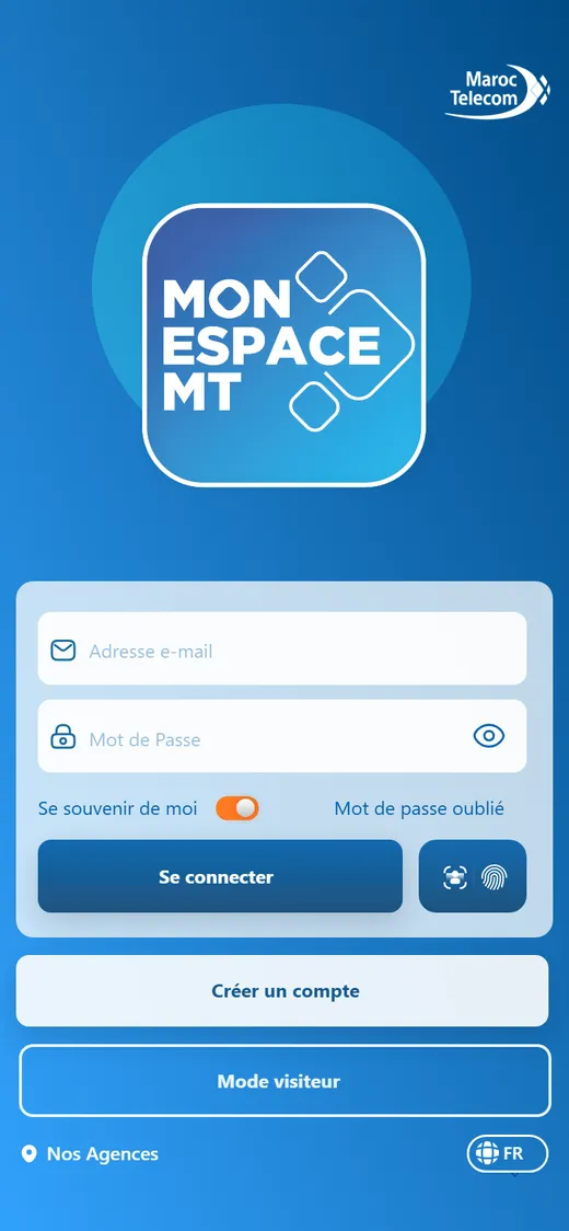
Maroc Telecom’s self-care app had grown service by service: mobile, fixed line and internet each had their own screens, and there was no home to come back to. I rebuilt it around the customer’s account, so people can see, pay and fix everything in one place.
Released 2023 · App Store & Google Play
My role
UI/UX designer at Netopia Solutions
Team
Netopia developers and a PM; Maroc Telecom’s technical and business teams approved every screen
Timeline
2022 – 2023
Platforms
iOS and Android
I owned
Audit, information architecture, flows, UI, the UI system, handoff
Result
42 screens validated · released 2023
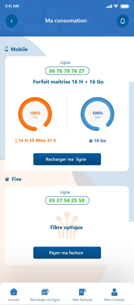
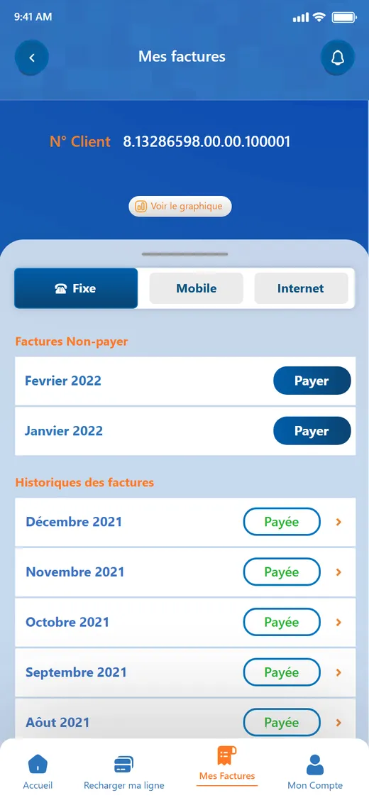
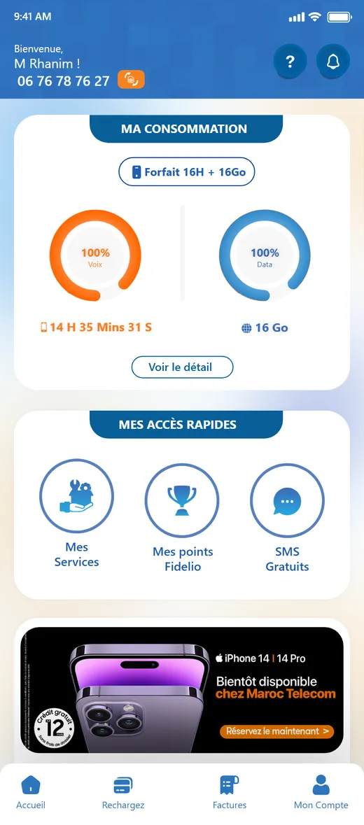
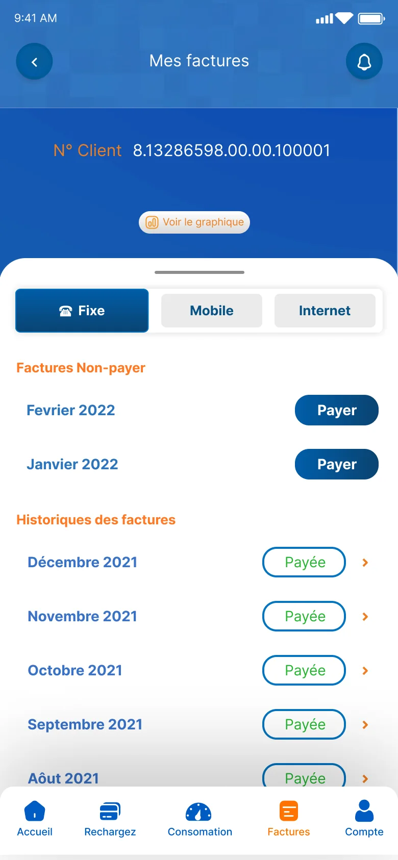
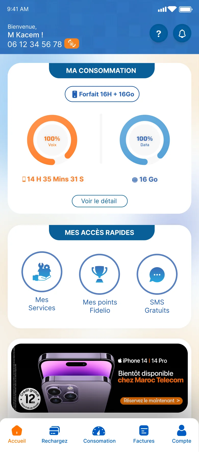
Home and Bills, from the screens Maroc Telecom validated.
01 · The problem
Everything was there. Nothing was easy to find.
I went through the live app task by task: check usage, pay a bill, recharge, recover a PUK, get help. Each one broke down in the same way. The app was organised around Maroc Telecom’s internal services, so customers had to know where things lived before they could act.
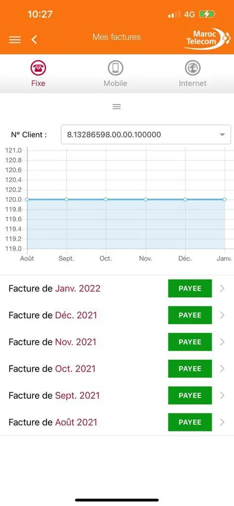
Billsa chart before the answerRechargethe machinery on showPUKtext before the taskHelpa phone bookHistorya wall of blocks
01
No home, no map
A hamburger menu, a back arrow and the same product tabs repeated on every screen. The only map was the customer's memory.
02
Data before answers
Bills opened on a tiny chart and a long client ID. "What do I owe?" was a scroll away.
03
Instructions, not guidance
Screens explained the system before the task, and disabled buttons gave no reason.
04
One app, many styles
Headers, buttons, pills and icons changed from screen to screen, so nothing could be learned once and reused.
02 · The approach
Structure before screens.
Before drawing anything, I rebuilt the structure. The account became the starting point, and every service became a destination inside it, reachable from one of five tabs. Then each task I had audited got one obvious place to start.
Before
Organised by service
☰ MenuFacturesConsommationRechargeAide
FixeMobileInternet…repeated on every screen
FixeMobileInternet
FixeMobileInternet
→
After
Organised by the account
Home: my consumption + quick accesses
AccueilRechargezConsommationFacturesCompte
Mes lignesChanger mon offreMes servicesFidelioSMS gratuitsPUKLiens utilesAgencesNotificationsHistoriqueLangue
Designed inside real constraints
Three identities. A mobile number, a fixed-line number or an internet payment ID: sign-up and every list had to handle all three.
Regulated payments. Card payments run through the CMI gateway, with its legal notice on the payment screen.
Personal data law. Sign-up carries the CNDP notice required by Moroccan law 09-08.
An established brand. Maroc Telecom blue and orange, and names customers already know: Jawal, Fidelio, Pass *1 to *22.
Customers without an account. Visitors still needed to recharge, pay a bill, get help and find an agency.
How we worked
I was the UI/UX designer on a Netopia team with developers and a project manager. On the Maroc Telecom side, the technical team and the business team followed the work: every one to two weeks we reviewed progress together, they validated screens, and validated screens went into development.
Audit & structure
Screen design
Client review every 1–2 weeks
Validation
Development
Release
03 · The design solution
Four decisions that shaped the app.
Each one started from a task that was hard in the old app. Where there’s a handle, drag it to compare the old and new screens.
Decision 01 · Home
Open on the answer, not on a menu.
The everyday question is “how much do I have left?”. So Home leads with it, and everything else has a fixed place around it.
Voice and data remaining, as two rings, with the current plan above them.
Quick accesses customers can customise, such as Services, Fidelio points and free SMS.
The promotion sits below the account, never above it.
One five-tab bar: Accueil, Rechargez, Consommation, Factures, Compte. Every task has a home and a way back. A swipe from the left also opens the full menu.
WhyRecognition over recall: customers see where they are and what they have, instead of remembering where it lives.
1234
Decision 02 · Bills
Separate what’s due from what’s done.
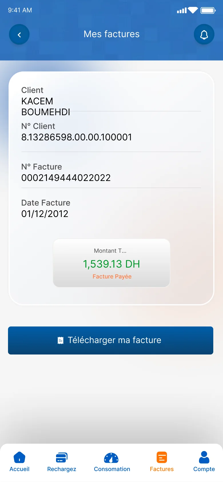
The old screen made customers read a chart before their own account. The new one puts unpaid bills first, each with one Payer button, then the paid history, with every bill one tap from its detail and PDF. Fixed, mobile and internet share one segmented control instead of three screens.
WhyOne primary action per row, and status before data. The next step is never a guess.
BeforeAfter⇆
Bill detail
Decision 03 · Recharge
Use the codes customers already know.
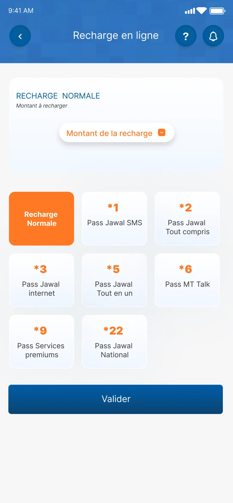
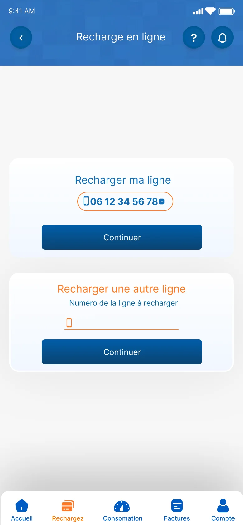
Prepaid customers know their passes by the short codes they dial: *1 for SMS, *3 for internet, *6 for MT Talk. The recharge screen shows each pass as a tile with its code, the amount comes first, then one Valider. Recharging someone else’s line is a separate, clearly labelled path.
WhyJakob’s law: reuse the model customers already have from their phone, instead of teaching a new one.
Another line
Decision 04 · Support
Put help where the problem is.
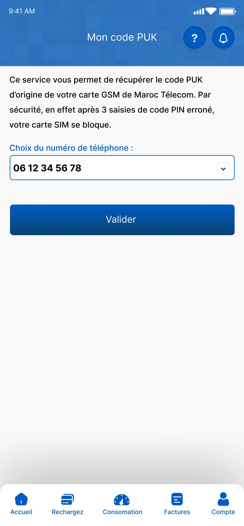
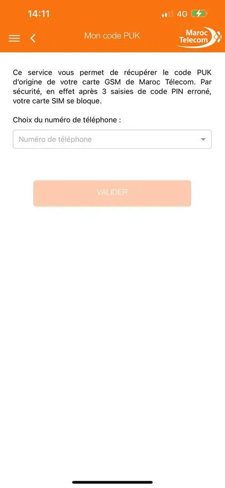
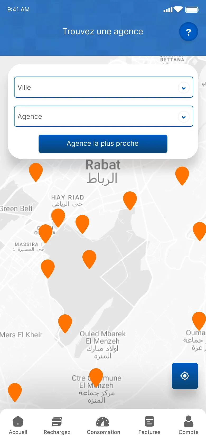
A blocked SIM is stressful. The PUK screen keeps one sentence of context, then one field and one button, with the line pre-selected. The agency finder puts a map and “Agence la plus proche” first, and works before login.
WhyEach support screen does one job, so a worried customer doesn’t have to read before acting.
BeforeAfter⇆
Agency finder
04 · The experience
Two journeys, end to end.
Decisions only matter if a whole task holds together. These are two of the flows I designed, screen by screen, as Maroc Telecom validated them.
Three product lines meant three ways to prove you’re a customer. The flow asks once, branches, then comes back together on the same SMS code and profile.
1 · Line typeMobile, or fixed & internet
2a · MobileOne number, a code by SMS
2b · Fixed & internetPick the identifier you have
3 · Your identifierPlus a mobile for the code
4 · SMS codeThe branches meet here
5 · ProfileWith the CNDP notice
From any screen, Factures is one tap away in the bottom bar. What’s due comes first, and paying goes straight to the CMI card form.
1 · HomeFactures is always in the bar
2 · BillsUnpaid first, one Payer each
3 · DetailAmount, status, PDF
4 · PaymentCard form through CMI
05 · The impact
Shipped, validated, one account.
2023Released on the App Store and Google Play
42screens reviewed and validated by Maroc Telecom’s technical team
3 → 1product lines (mobile, fixed, internet) in one account, one home, one bar
What I’d measure
I don’t have post-release analytics for this app, so there are no usage numbers here. These are the four that would show whether the redesign worked:
Time to pay a bill, from opening the app to confirmation.
PUK recoveries completed in the app, versus calls to customer service.
Recharge completion rate, and where people drop off.
App-store rating and review themes, before and after the release.
06 · What I learned
Structure first, screens second.
Most of the old app’s problems weren’t visual. They disappeared once the account, not the service, became the starting point: one home, five tabs, and a fixed place for every task. Settling that structure before designing a single screen is what kept 42 screens, reviewed by two client teams, consistent with each other. It’s the order I still work in.
The system behind the screens, and every validated screen.
UI system · 42 screens, one language
One language across 42 screens.
The old app looked assembled from different products. I defined a small set of foundations and components and applied them across every screen.
Colour
Action
Deep
Signal
Success
Error
Muted
Surface
Card
Blue carries every action. Orange is reserved for what needs attention: the active tab, unpaid bills, the user's own numbers.
Type · Graphik + Saira
1165MA CONSOMMATIONMes facturesFévrier 2022
Saira carries figures and ribbons; Graphik carries titles, labels and body.
Components
Header with back, help and notificationsConsumption ringSection ribbon cardPass / plan tileService toggle cardSuccess and error dialogsSegmented controlBill row with Payer
Screens · tap any screen to enlarge
The validated screens.
The screen set Maroc Telecom validated, all built on the same five-tab bar.
Se connecterMode visiteurAccueilMa consommationMes lignesChanger mon offreDétails du forfaitMes servicesMes points FidelioSMS gratuitsHistoriqueNotificationsLiens utilesFAQLangueErreurInscription InternetPaiement en ligne
One language for every screen.
The foundations, components and rules behind Mon Espace MT. Every value here is taken from the validated app screens; components are live and clickable.
Account first
Show the customer's own numbers before anything else.
One action per row
A list item has one primary action; detail is one tap away.
Orange means attention
Reserved for the active tab, what's due and the user's own identifiers.
Colour
Built from Maroc Telecom's blue and orange. Blue carries every action; orange is rationed so it always means "look here".
Action#005BC3 Links, tabs, icons, borders
Deep#0A4472 Primary button end, ghost button
Sky#2D75BD Headers, list labels
Signal#FF7300 Active tab, due items, line numbers
Success#167344 Success text and icons
Error#B42318 Field errors
Neutral#656464 Secondary text, disabled
Surface#F7F7F7 Screen background
60 · surface & cards30 · action blue10 · signal
DoUse Signal for one thing per screen region: the active tab, the "à payer" section title, a line number.
Don'tUse orange for buttons next to blue buttons. The error dialog's orange "OK" is the one exception.
Don'tPut Signal text on white under 18px; use #A64500 for small orange text to keep AA contrast.
Typography
Two faces with separate jobs. Graphik carries the interface: titles, labels, body and fields. Saira carries the customer's numbers and the section ribbons, so balances and percentages read as data at a glance.
ActiveIcon and label in Signal. Inactive in Action blue.
Where things liveLines, plans, help, PUK, history, notifications and language sit under Compte; Services, Fidelio and free SMS are quick accesses on Accueil.
Feedback
Every form ends in a dialog that says what happened and gives one way forward.
✓
Vos données ont été mises à jour avec succès.
!
Votre mot de passe ou e-mail est incorrect. Veuillez réessayer.
DoName the action on the button ("Réessayer") rather than "OK" when there's a next step.
Don'tBlame the customer. Say what to do next.
Tokens
The names developers use.
Token
Value
Use
color.action
#005BC3
Interactive elements
color.action.deep
#0A4472
Button gradient end, outlines
color.signal
#FF7300
Active, due, attention
color.signal.text
#A64500
Small orange text
color.success
#167344
Success
color.error
#B42318
Errors
color.surface
#F7F7F7
Screen background
space.1 … space.8
4 · 8 · 12 · 16 · 24 · 32
Layout
radius.input / button / card
8 · 10 · 22
Shape
font.ui
Graphik
Titles, labels, body, fields
font.data
Saira
Figures, rings, ribbons
Case study · Pre-launch PWA · 2026
MyWarranty: never miss a deadline again
A warranty and document tracker I designed and built with AI in six weeks. It reads your receipts, keeps your passport and license next to your products, and warns you 30, 7 and 1 day before anything runs out.
My role
Product & UI/UX design, built with AI
Timeline
Sep 24 – Nov 3, 2026
Platform
Installable web app (PWA) for Android & iPhone
Team
Just me, with Claude and AI coding agents
Status
Feature-complete, launching soon
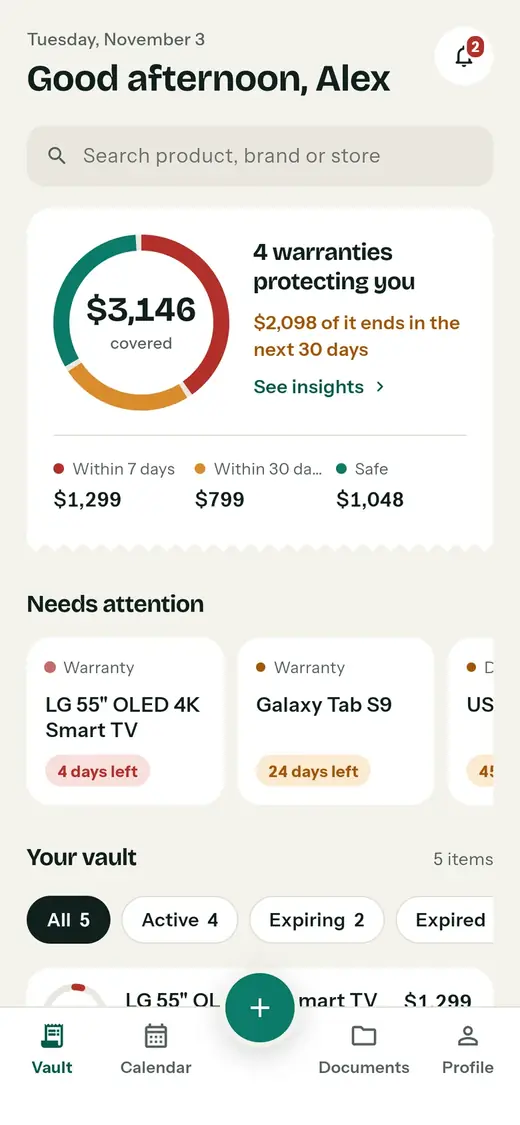
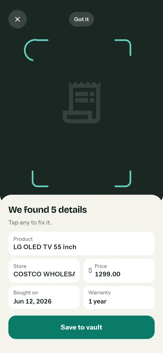
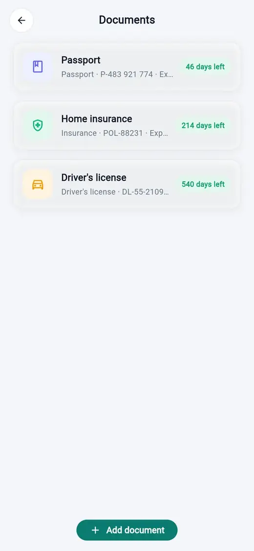
The redesigned app with sample data. Left to right: documents, the vault, a scanned receipt.
At a glance
Warranty apps track receipts. Mine also tracks the papers that can get you fined.
Problem
Warranties and documents expire without warning. The date is printed on the receipt or the card, and nothing tells you before it passes.
What I did
Framed the product, designed every screen, directed AI agents to build it, audited my own v1, then redesigned it around one question: what needs me now?
Outcome
A working PWA with 17 screens, offline receipt scanning, 10 languages and a design system enforced in code. Public launch is next.
6weeks from first commit to a feature-complete app
17screens, from onboarding to claim letters
10languages, including right-to-left Arabic
30·7·1days before expiry, when reminders go out
Where it started
A routine roadside check, and a license that had quietly expired
I already wanted one place for receipts and warranties, with a nudge before they run out. Plenty of apps do that, so I wasn't sure mine needed to exist.
Then I was stopped at a police check while driving and learned my driver's license had expired. I hadn't noticed. Nothing had warned me.
That changed the product. A warranty that lapses costs you a repair. A document that lapses can cost you a fine, a trip, or a day of paperwork. Documents became the reason MyWarranty exists, not an extra tab.
The expiry date is printed right on the card. Nothing warns you before it passes.
The insight the whole product is built on
The problem
Four ways people lose coverage they already paid for
Receipts fade or vanish
Thermal paper goes blank, emails get buried, and store accounts are hard to dig through.
Warranties end silently
Nothing reminds you that a 1-year warranty ends next week, so the repair you could have claimed becomes yours to pay.
Documents need lead time
A passport can take weeks to renew. A 1-day reminder is useless for it, but fine for a TV warranty.
Claims are a scavenger hunt
Serial number, purchase date, price, store, receipt: by the time you find them all, you've lost an afternoon.
How might we…make sure people use the coverage they already paid for, and never get caught out by an expired document, without asking them to remember anything?
Warranties and documents need different reminder rules. That became the first product decision:
Item
First shows up
Reminders
Why
Warranty
30 days before
30 · 7 · 1 days
Enough time to test the product and file a claim
Passport
6 months before (default)
30 · 7 · 1 days
Renewal can take weeks; travel plans can't wait
ID card, driver's license
3 months before (default)
30 · 7 · 1 days
Appointments and paperwork take time
Insurance
1 month before (default)
30 · 7 · 1 days
Usually renews with a call or a click
v1, and what it got wrong
I shipped a working v1 fast, then reviewed it like someone else's work
With AI agents writing the code, v1 had the full feature set within days: scanning, cloud sync, push reminders, app lock, calendar, stats, claim letters, export and 10 languages. It worked. It also had the problems you get when features arrive faster than design decisions.
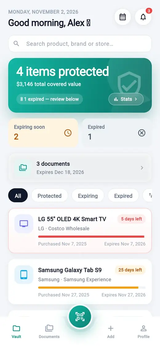
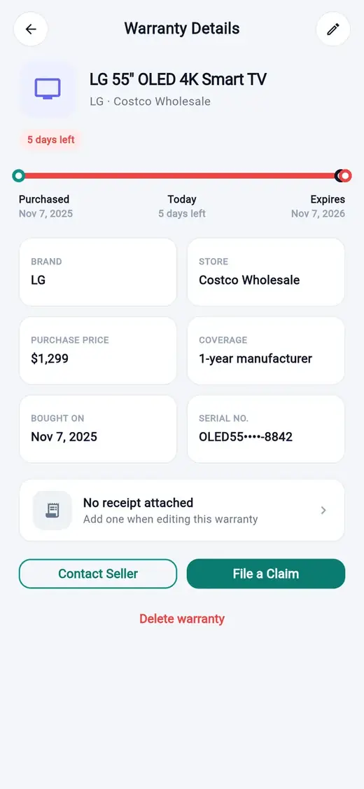
So I ran a heuristic review of my own screens. These are the real v1 screens; the numbers match the findings below.
1126
v1 Home
58
v1 Warranty details
3
v1 Documents
4
v1 Claim
Broken glyphs. Emoji in the greeting and the "1 expired" chip rendered as empty boxes in light mode.
Numbers that disagreed. Home said "4 items protected", Stats said "5 items tracked". A 5-day item was red on Home but amber on the calendar.
Inconsistent privacy. Serial numbers were masked, but the passport number sat in full on the Documents list.
A letter that lied. The claim said "Please find my receipt attached" on an item with no receipt.
A dead end. "No receipt attached, add one when editing" sent people elsewhere instead of letting them attach it right there.
Two ways to add. A centre scan button and an "Add" tab competed for the same job.
A vanity headline. "4 items protected" told you nothing about what needed you.
Loud destruction, quiet structure. A red Delete link under the main actions; gradient buttons everywhere, so status colours competed with actions.
Principles
Five rules that settled every debate in the redesign
Show the finding, not the data
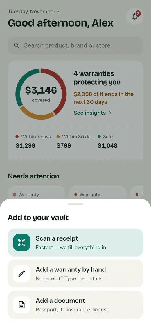
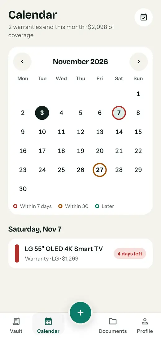
Lead with "$2,098 of it ends in the next 30 days", not "4 items protected". Every screen answers what needs you now.
One number, one source
Every total is computed from the items, never typed twice. If two screens can disagree, they eventually will.
Colour means urgency, never decoration
Red is 7 days or less, amber 30 or less, green is safe. Buttons are teal and flat, so a status never competes with an action. Status is always written in words too.
Private by default
Sensitive numbers are hidden everywhere and shown only when you ask. One rule, no exceptions.
Delight only where it confirms something
The ring shows time running out. The stamp confirms a save. Nothing animates just to look busy.
Key decisions
Six decisions, with what each one cost
Decision 1
A ring split by urgency replaces the vanity number
Context
v1's hero said "4 items protected" while Stats said 5. Neither told you what to do.
Options
A list of totals; a progress bar per item; one ring for the whole vault.
Decision
One ring of covered value, split into within 7 days, within 30 days and safe, with the finding in words beside it. Each item also gets a small ring that drains over time.
Trade-off
Rings are harder to read precisely than bars, so the exact amounts sit right under the ring.
BeforeA total that hides urgency
AfterWhat ends, and when
Decision 2
A web app instead of two app-store apps
Context
I had a working Android build. Shipping natively meant store accounts and reviews, a Mac for iOS builds, and in-store billing.
Options
Native Android + iOS; Android only; one installable web app (PWA) from the same codebase.
Decision
PWA only. One link works on Android and iPhone, updates ship instantly, and payments can run on the web later.
Trade-off
Notifications. iPhone only allows push for web apps added to the Home Screen (iOS 16.4+), and the browser can't use fingerprint unlock, so the web app uses a PIN. I designed around that instead of hiding it.
Always works
Inside the app
The bell and "Needs attention" show what's ending every time you open it.
One-time setup
On the lock screen
Push at 30, 7 and 1 day. Android: sign in and allow. iPhone: add to Home Screen first, open from the icon, then allow.
Safety net
In your calendar
Export every date as a calendar file with alerts built in, for anyone who blocks notifications.
Decision 3
Documents get their own lead time and stay hidden
Context
v1 showed the full passport number in a list, and gave a passport the same 30-day warning as a TV.
Decision
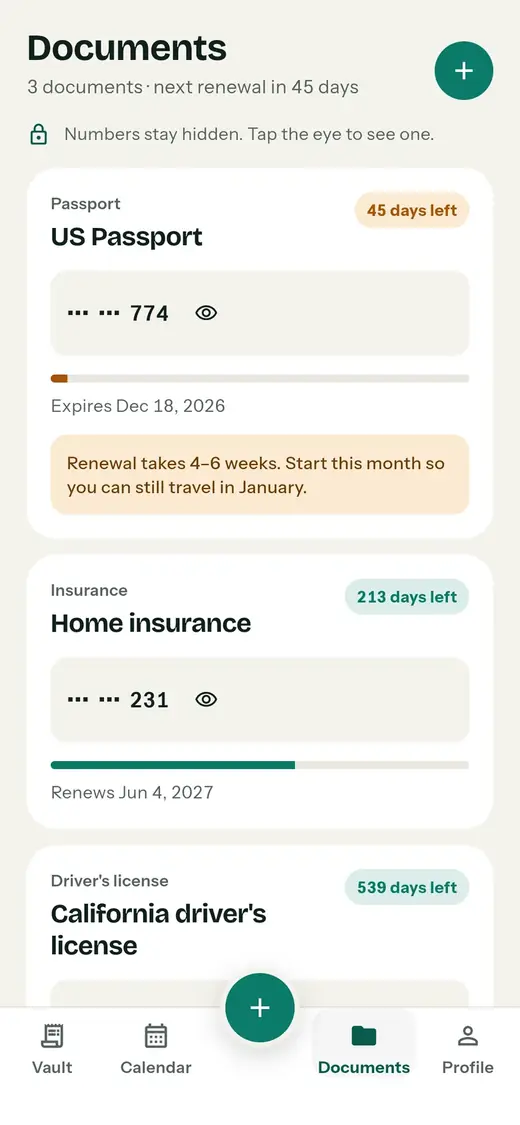
Numbers are masked everywhere (••• ••• 774) and revealed with a tap. Each document picks how early it shows up: 1, 3 or 6 months. A passport near its date gets a plain-language tip.
Trade-off
One more tap to read a number. Worth it for something you'd never want visible on a shared screen.
BeforeNumber fully visible
AfterMasked, with lead time
Decision 4
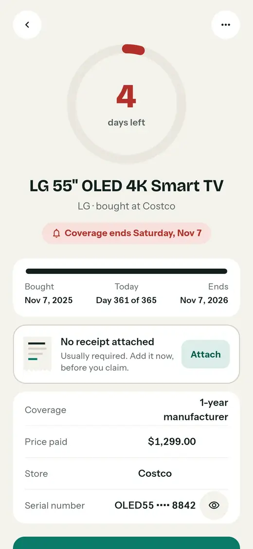
The claim letter tells the truth, and fixes the gap on the spot
Context
v1's letter claimed a receipt was attached when none was, and the details screen sent you to Edit to add one.
Decision
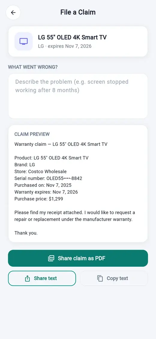
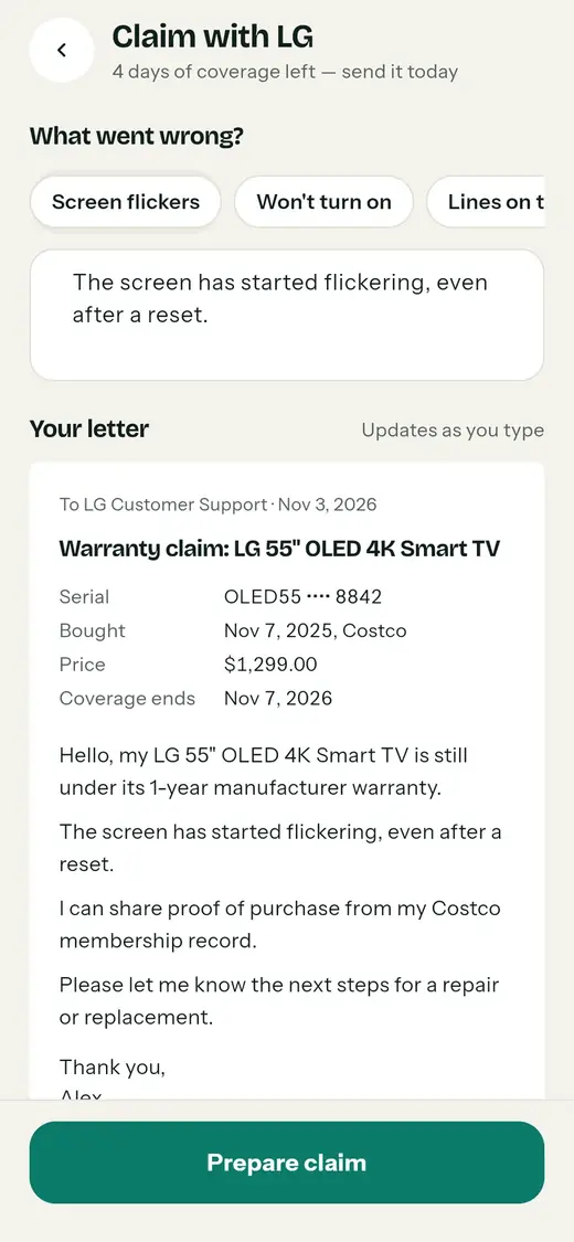
The letter is previewed live as you describe the problem, and its wording changes with what you actually have. Missing receipt? An Attach button sits right on the details screen.
Trade-off
More states to design and test. The alternative was a letter that could embarrass the user in front of a manufacturer.
Before"Receipt attached" with no receipt
AfterWording matches reality
Decision 5
One + button instead of two ways to add
Context
v1 had a centre scan button and an Add tab doing overlapping jobs.
Decision
One centre button opens a sheet with three choices: scan a receipt (the fastest, so it comes first), add a warranty by hand, or add a document. The freed tab became Calendar.
Trade-off
Scanning is one extra tap away. The sheet makes the choice explicit, which matters more for first-time users.
AfterOne entry point
AfterThe freed tab: Calendar
Decision 6
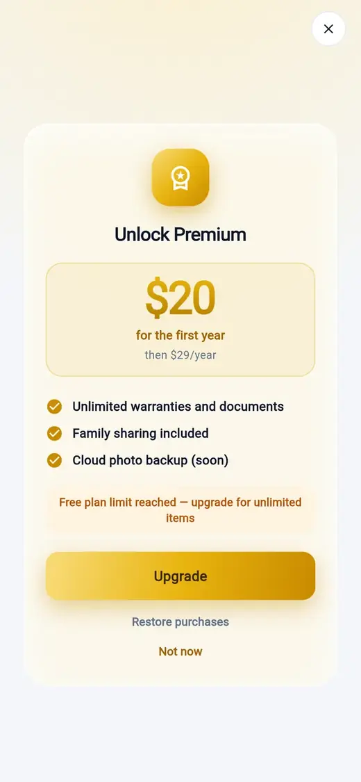
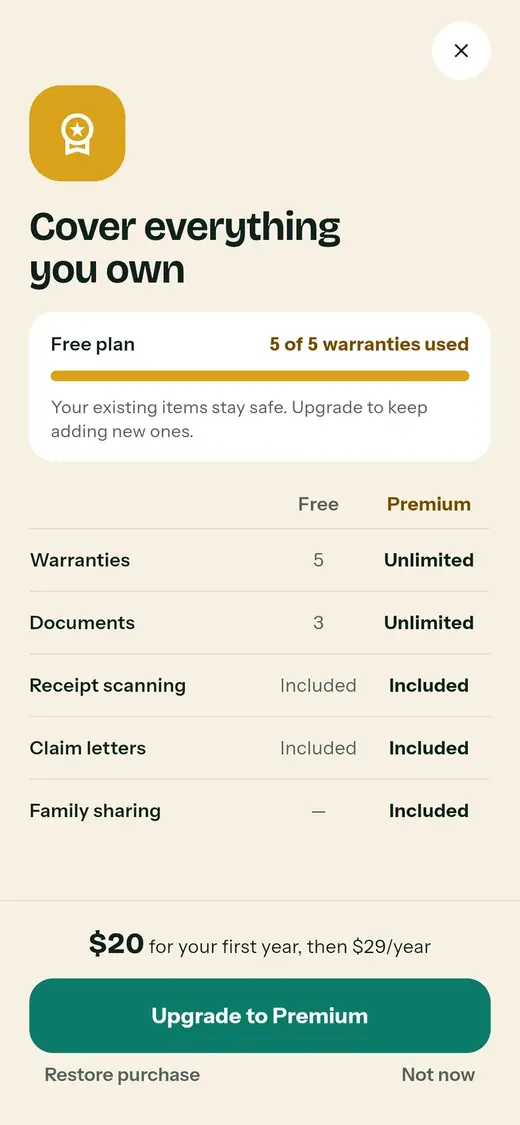
The paywall appears only at the limit, and says why
Context
Free covers 5 warranties and 3 documents. v1's paywall was a gold card with a vague "limit reached" line.
Decision
It shows only when you try to add one more, with your real usage ("5 of 5 warranties used"), a plain Free vs Premium table, and the reassurance that existing items stay safe.
Trade-off
Fewer upsell moments. I'd rather earn the upgrade at the moment it's obviously useful.
BeforeVague limit message
AfterUsage and a clear comparison
What I threw away
I built a full "liquid glass" redesign, then deleted it the same day
Before the current design, I had the agents build a second visual system inspired by Apple's liquid glass: frosted panels, an aurora background, a floating capsule nav, plus a written design system for it. It shipped to the test site and passed every check.
I removed it and restored the classic UI the same day. The glass drew attention to the surface instead of the deadlines: text over blur is harder to read, every card looked equally important, and the red and amber that should warn you competed with the effects.
That failure gave me the brief for the redesign that stuck: a calm paper-like background, flat surfaces, and colour reserved for urgency. Being able to try a direction in hours, and throw it away, is the real advantage of building with AI. The judgment about what to keep is still the designer's job.
Flows & states
Scanning is four states, and each one says what's happening
Choose scan
Scan is the first and largest choice in the + sheet.
Read and check
The receipt is read on the phone, offline. Any field can be fixed with a tap.
Saved, with a countdown
The item gets its ring, its timeline and its reminders.
Surfaced when it matters
Close to the date, it moves to Needs attention.
I designed the states nobody screenshots for a portfolio, because they decide whether people trust the app. Every popup and confirmation now goes through one shared component, and these key states have visual tests in the codebase.
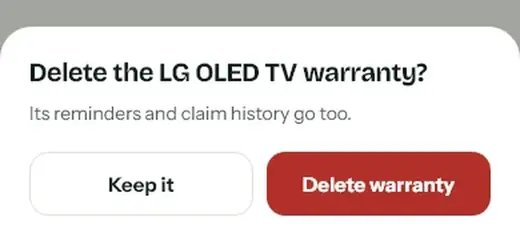
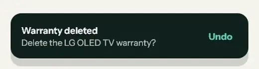
ConfirmNames the item and the consequence.
Undo instead of "Are you sure?" twiceDeletes wait 6 seconds before they're final.
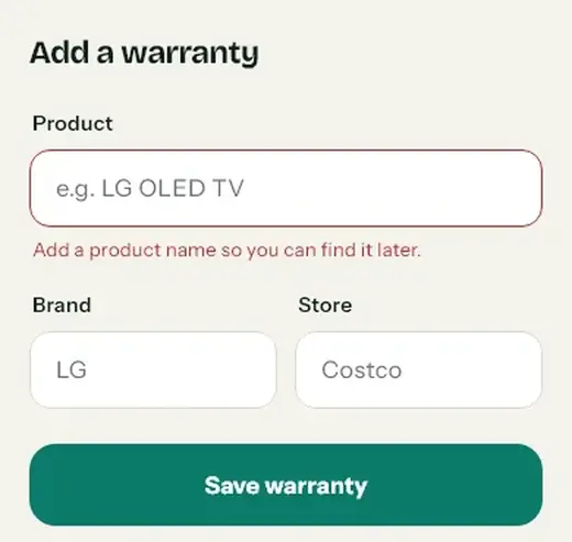
Inline errorsSay what to do, never blame.
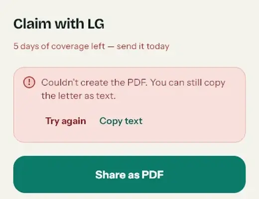
Errors stay in their blockAlways with a way forward.
Empty states keep their frameAnd offer the next action.
Success as a stampConfirms the save with the end date.
Design system
A small system, written into the code so the AI can't drift from it
Every colour, radius and motion value lives in one tokens file the app reads from. The signature motif comes from the logo: the zig-zag edge of a torn receipt, used only where something really is a receipt or a document.
Colour
A warm paper ground, ink text, and colour that means something. Every text pair passes WCAG AA.
Ground#F4F2EC
Ink#10201C · 15.1:1
Muted#55625E · 5.7:1
Action / safe#0B7A69 · 5.2:1
Urgent · ≤7 days#B3302A · 6.2:1
Soon · ≤30 days#A3550A · 5.4:1
Premium only#D9A21B
Type
Bricolage Grotesque for titles and numbers that matter, Instrument Sans for everything else. All figures are tabular so countdowns don't jitter.
Display 52 / 800
4 days left
Title 28 / 700
Good afternoon, Alex
Section 18 / 700
Needs attention
Body 15 / 600
LG 55" OLED 4K Smart TV
Meta 13 / 400
LG · bought at Costco
Signature components
Coverage ring
Drains as time passes. Never shorter than 4% of the circle, so "4 days left" never reads as zero.
Status chips
4 days left24 days left671 days leftEnded 13 days ago
Same rule everywhere: ≤7 days red, ≤30 amber, then green. Always in words, never colour alone.
Stamps
PROTECTEDEXPIRED
A rubber-stamp confirmation that lands in 300ms. Used for save, file, expired and Premium.
Tear card
Warranty claim: LG 55" OLED Serial OLED55 •••• 8842
The receipt edge from the logo. Only on receipts, letters and the coverage card.
Buttons
Save warrantyKeep itDelete warranty
One teal primary per screen. Labels start with the verb and name the object.
Masked value
••• ••• 774
Every sensitive number, everywhere. Revealed with a tap on the eye.
Motion
Only transform and opacity. Every animation has a reduced-motion version.
Moment
What it tells you
Duration
Button press
Your tap registered
150 ms
Sheet / screen enter
Where the new options came from
300 ms
Ring draw + value count-up
How much time and money is left
1,000 ms
Stamp
It's saved
300 ms
How I worked with AI
I made the decisions. AI did the typing, and I checked its work.
I design products; AI let me take MyWarranty from an idea to a working product on my own. Here is who did what at each step.
FrameProblem, users, rules
I owned
The problem, the document-first angle, the reminder rules, pricing and limits.
AI did · how I checked
Turned my notes into a roadmap. I approved each item before it was built.
Build v1Features, fast
I owned
Every feature request and every acceptance test on a real Android phone.
AI did · how I checked
Coding agents wrote the Flutter code and logged each session. I tested on device before marking anything done.
AuditCritique my own v1
I owned
Which problems mattered and in what order.
AI did · how I checked
Claude did a heuristic pass on my screenshots. I kept the findings I could verify on screen and dropped the rest.
ExploreDirections in hours
I owned
Killing the liquid-glass direction and choosing the calm, status-first one.
AI did · how I checked
Built both directions as working UI and coded prototypes, so I judged them on a real screen, not a mock-up.
Spec & guardKeep the AI on the rails
I owned
A build spec and a rule file every agent must follow: tokens only, one dialog component, no gradients.
AI did · how I checked
Followed the rules, then proved it: zero native dialogs, visual tests for every state, analysis and tests passing.
# AGENTS.md (excerpt), the rules every AI agent must follow- UI follows the current warm-paper redesign: Bricolage Grotesque + Instrument
Sans, MwColors, coverage rings, tear cards and status stamps. Do not
reintroduce the old teal-gradient / system-font prototype.
- ALL popups/feedback use the shared GlassToast. Never build a one-off popup.
- ALL confirmation dialogs use showGlassConfirm. Never use raw
showDialog/AlertDialog for confirmations.
- Do not commit unless asked.
Writing the rules down is how I keep the design consistent when the person typing the code isn't a person.
Outcome
Feature-complete and pre-launch, with honest gaps
Shipped
17 screens in the new design, running as an installable PWA
Offline receipt scanning in the browser, with nothing uploaded
Cloud backup and sync, PIN lock, export to CSV, PDF and JSON
10 languages with right-to-left Arabic and local currency
A daily reminder job for warranties and documents
A public website rewritten to match exactly what the app does
Before launch
Turn on web push with its signing key
Web checkout for Premium
Family sharing and cloud receipt-photo backup (marked "coming soon")
Receipt scanning beyond English on the web
There are no user numbers yet, so I won't invent any. After launch I'll track four things: the share of items added by scanning instead of typing, how many people allow notifications (especially on iPhone), how many reminders turn into an opened item or a claim, and free-to-Premium conversion at the item limit.
Reflection
What I'd tell myself at the start
Speed hides problems
AI got me a full feature set in days. The design debt arrived just as fast. Next time I'd write the principles and tokens before the first feature, not after.
Trying is cheap, deciding isn't
I could build a whole visual direction in hours and delete it the same day. The hard part was knowing why it was wrong, and writing that down so it didn't come back.
Platform limits are design material
iPhone's rule for web push could have been a footnote. Designing three layers of reminders around it made the product more honest and more reliable.
Next: test the onboarding and the iPhone install flow with five people who've never seen the app, before launch. That's the step this project skipped, and the one I most want to fix.
Living design system · v1.1
A vault that reads like a receipt.
The color, type, spacing, motion and component rules behind MyWarranty — a warranty and document expiry tracker for Android, iOS and the web. Built from the shipping Flutter code, not a parallel mockup.
This page documents the current light build. The marketing screenshots in marketing/screenshots show an earlier teal-gradient theme; use this page and the code as the source of truth.
The tear edge, the segmented coverage ring and the status chip are the three elements that make a MyWarranty screen recognizable. They appear together only on the vault and the item detail.
On this page
01 — Foundations
The product is a receipt you can trust.
MyWarranty is not a dashboard with products in it. It is a vault built from the objects people already keep: receipts, serial numbers, expiry dates and stamps. The visual system borrows their language — warm paper, ink, a torn edge, a rubber stamp — and removes everything that does not help someone act before a deadline.
Brand idea
Warm paper, teal ink, one clear deadline.
The ground is warm paper #F4F2EC, not sterile white. Teal is the one action and “safe” color. Amber and red are reserved for time running out. The interface should feel calm until it has something urgent to say.
CalmLegibleLocal-firstHonest about limits
Logo & usage
Receipt + check
Rounded-square teal tile, white receipt, teal check. The mark is 22.5% corner radius. Keep clear space equal to the corner radius; never recolor the check separately.
Four motifs carry the identity. They should feel inevitable, not decorative. Use them where they explain something; do not tile them across every surface.
Receipt
Tear edge
A zig-zag bottom edge, 7px deep, 14px tooth width. The home coverage card is the main use.
Tear edge
The receipt is the object. The edge belongs on the coverage card, receipt thumbnails, claim letter and saved card — not on every card.
68%covered
Coverage ring
One ring answers “how much time is left?” It is segmented by status on the vault, whole on the detail, and tiny on list rows. A 4% minimum arc keeps a nearly expired item visible.
PROTECTEDEXPIREDPREMIUM
Stamp
A stamp lands once, at 1.6× scale, rotated −8°, with a teal, red or gold border. It marks a completed state: saved, filed, protected, expired, premium.
Value protected$3,146
Days left214
ExpiresNov 7, 2026
Tabular numbers
Money, days, dates and counters use tabular figures. Numbers should line up in lists, not shimmer as they change.
Five principles
These are the rules that settle debates in the product. If a new screen cannot be explained with them, it is probably the wrong screen.
The receipt is the object
Start from what the user already has: a receipt, a serial, an expiry date. Do not invent a second data model.
Status is a sentence
Never color alone. Every status carries words: “5 days left”, “Expires today”, “Ended 13 days ago”.
Calm surfaces, loud deadlines
Neutral paper and ink for structure. Amber and red appear only when time is actually running out.
One decision per screen
Each screen has one primary action. Secondary actions stay quieter; destructive actions require confirmation.
Privacy is visible
Lock, mask, local-only, cloud status. Say what stays on the phone and show the state instead of hiding it.
02 — Color
Teal for action. Amber and red for time.
The palette is deliberately small. Teal identifies the brand, primary actions and “safe” coverage. Amber and red belong to expiry status and destructive actions. Gold is used only inside the premium paywall. Nothing else gets a color.
Core surfaces
GroundMwColors.ground#F4F2ECApp background — warm paper
ExpiredExpiryState.expired#55625E · tint #EAE7DFEnded items; rows at 72% opacity
State
Days left
Color
Tint
Ink
Copy
Safe
> 30
#0B7A69
#DCEEE9
#075A4D
“214 days left”
Soon
8–30
#A3550A
#FAEAD2
#6B3A08
“15 days left”
Urgent
0–7
#B3302A
#F8E0DC
#831C1E
“5 days left” · “Expires today”
Expired
< 0
#55625E
#EAE7DF
#55625E
“Ended 13 days ago”
Documents use the same states, but passports enter “soon” at 90 days because renewal takes 4–6 weeks. Status is always computed from date-only values in the user's local time zone. On segmented rings, the amber segment uses the lighter #D98B2B (soonRing) so it stays distinct from red; text and chips use #A3550A.
GoldMwColors.gold#D9A21BPremium icon tile, usage bar
Gold inkMwColors.goldInk#7A4A00Premium text and stamp
CameraMwColors.camera#1B2623Scan screen ground; white / #C9D3D0 text
Measured contrast
Key text pairs from the shipping palette, measured against WCAG 2.1. Body text passes 4.5:1; large display text passes 3:1. Do not lighten muted text to “soften” a screen.
Pair
Ratio
Use
Ink on ground
15.06:1
Primary text
Ink on surface
16.86:1
Primary text on cards
Muted on ground
5.69:1
Secondary text
Muted on surface
6.37:1
Secondary text on cards
White on teal
5.25:1
Primary button label
White on urgent
6.23:1
Destructive confirm label
Urgent on urgent tint
4.95:1
Urgent chip text
Soon on soon tint
4.60:1
Soon chip text (minimum)
Teal ink on teal tint
6.77:1
Safe chip text
Gold ink on gold ground
6.64:1
Premium copy
Scope noteDark mode is not part of this build.
The current token set is light-only. An earlier build and the marketing screenshots included a dark theme; do not present those screens as current until the parallel token map is re-shipped. If dark mode returns, every token needs a counterpart — never a one-off dark hex in a component.
✓Do
Use teal for one primary action and for “safe”.
Use amber/red only for time and destruction.
Pair every status color with a short sentence.
Keep the ground warm paper; let white cards do the lifting.
×Don't
Use status colors as decorative backgrounds or buttons.
Use gold outside the paywall and premium states.
Add gradients to cards, buttons or the hero.
Use white text on the ground or on pale tints.
03 — Typography
Bricolage carries the voice. Instrument does the work.
Bricolage Grotesque is used for titles, big numbers and stamps. Instrument Sans carries body copy, labels, buttons and metadata. The pairing is warm and slightly editorial, but both faces stay legible at small sizes across 10 languages.
Bricolage Grotesque
Display · 500–800 · −0.36px tracking below 30px, −0.75px at 30px and above. Used for H1–H3, product names, countdowns, KPI values and stamps.
52 / 80028 / 70018 / 700
Instrument Sans
Text · 400–700 · line height 1.45 for body. Used for paragraphs, labels, buttons, list rows, helper text, chips and tabular numbers.
16 / 40015 / 60012 / 700
Type scale
The Flutter text theme is the canonical scale. Some screens use one-off sizes for dense data (10.5px chart labels, 11px badge counters); those are listed after the scale.
Role
Specimen
Size / weight / height
Use
displayLarge
Aa 3,146
52 / 800 / 1.0
Detail countdown
displayMedium
Aa 365
34 / 800 / 1.05
Onboarding values
displaySmall
Good morning
28 / 700 / 1.1
Tab titles, greeting
headlineLarge
LG OLED TV
26 / 700 / 1.15
Detail product name
headlineMedium
Add a warranty
22 / 700 / 1.2
Sub-screen titles, top bar
headlineSmall
Add to your vault
20 / 700 / 1.2
Sheet and dialog titles
titleLarge
Needs attention
18 / 700 / 1.25
Section titles
titleMedium
Warranty name
16 / 600
List titles, buttons
titleSmall
Brand · Store
15 / 600
List subtitles, card titles
bodyLarge
Point your camera at any receipt. MyWarranty reads it.
16 / 400 / 1.45
Intro and body copy
bodyMedium
We'll remind you 30, 7 and 1 day before.
15 / 400 / 1.45
Default body
bodySmall
Purchased Nov 7, 2025
14 / 400 / 1.45 · muted
Supporting text
labelLarge
Save warranty
16 / 700
Primary button
labelMedium
TV & video
14 / 600
Field labels, chips
labelSmall
365 days of coverage
12 / 600 · muted
Badges, tertiary labels
Single-use sizes: 11px for counters and axis labels, 10.5px for chart axes and calendar labels, 9px for scanner hints. Nothing below 10.5px should carry essential information.
Rules
Numbers are tabular
Every amount, day count, date and counter uses tabular figures. Price, progress and countdown columns must align between rows.
3,146 · 214 · Nov 7, 2026 · $1,299
Sentence case, except stamps
Screen titles, buttons, labels and status copy are sentence case. Uppercase is reserved for stamps: PROTECTEDEXPIREDPREMIUM.
Keep body lines short
Body copy sits in a column of 60–70 characters. On wide screens, cap reading columns at 640px and never stretch text across the full tablet width.
No decorative type
No italics for emphasis, no all-caps headings, no emoji. Emphasis comes from weight, size or a status chip — not from another typeface.
04 — Space & layout
A 4pt grid, with 14px between cards.
The app uses a 4-point base grid. Phone screens start with 20px side padding; wide layouts use 28px. Cards have 16px internal padding by default. The vertical rhythm on the vault is 14px between rows and 26px between sections.
Spacing scale
4
6
8
10
12
14
16
18
20
22
24
26
28
32
40
48
Token
Phone
Wide / tablet
Where
Screen padding
20px
28px
All tab screens and full-page flows
Card padding
16px
16–22px
MwCard, hero card, detail panels
List gap
8px
8px
Vault rows, documents, calendar events
Home section gap
26px
26px
Coverage → Needs attention → Your vault
Home row rhythm
14px
14px
Vertical rhythm between vault cards
Touch target
≥ 44px
≥ 44px
Every icon button, chip, row action
Content max width
—
1200px
Wide home, centered with 28px gutters
Breakpoints
Phone
< 600px
Bottom navigation with a center FAB. Page flows are full-screen. Content side padding is 20px. The prototype width is 390×844.
default
Tablet / rail
≥ 600px
Navigation rail replaces the bottom bar. Sheets become centered dialogs up to 560px. Full pages open as centered sheets.
MwNavRail
Wide home
≥ 760px
The vault becomes two columns: coverage and attention on the left, the item list on the right. Max content width is 1200px.
_wide()
Layout rules
Safe area first
Every full screen wraps content in SafeArea. Bottom navigation adds the device inset; the FAB lifts −30px above the bar. Never place a tap target under the home indicator.
Do not stretch the phone
On tablets, extend the layout with a rail or a two-column home. Do not scale a 390px screen to fill a 1024px canvas. Text columns stay ≤ 70ch.
44px is the floor
Icon buttons are 44×44. Chips sit inside a 44px tap target even when the visible pill is 36px. Rows are at least 48px tall when they contain a control.
Density is earned
Small type is allowed only for secondary metadata (axis labels, badge counters, scanner hints). Primary information never drops below 13px on phones.
05 — Shape & depth
Soft corners. Almost no shadow.
Most surfaces are flat white cards on warm paper. Shadows are reserved for things that actually float: the FAB, menus, sheets, dialogs and the toast. A card at rest has a 1px line, not a shadow.
Radius
Applied to
Preview
44px
Screen corners in promotional/full-bleed surfaces
28px
Bottom sheets, wide-page dialogs
24px
Dialogs, paywall icon tile, menu cards
22px
Hero card, tear card, summary card
20px
Detail panels, list cards
18px
List rows, secondary buttons, primary buttons
16px
Toasts, inline banners, calendar cards
14px
Inputs, fields, segmented track, buttons in dialogs
12px
Small tiles, thumbnails, inner controls
999px
Pills, chips, badges, status
Elevation
Floating action
0 6px 16px rgba(16,32,28,.18)
Center FAB and rail add button.
Menu / sheet
0 12px 32px rgba(16,32,28,.16)
Sheets, dialogs, hover menus, toast.
Card at rest
none
1px --line border only.
Borders and opacity
Line weights
1px line / control — card and input borders.
1px rule — dividers inside cards.
1.5px teal — focused input.
2px — stamps and focused dialog buttons.
4px ground — FAB ring against the nav.
Opacity rules
Expired vault row: 0.72 plus an EXPIRED stamp.
Scrim: #5C10201C (36% ink).
Toast subtext: white at 72%.
Disabled fill: #D6D1C4; label #4A524F.
06 — Motion
Motion shows what changed. It never performs.
The motion system is small and functional: a ring draws once, a stamp lands once, a toast slides in, a page enters. Nothing loops for decoration. Urgent dots pulse three times and stop. Reduced motion is a first-class state, not an afterthought.
Easing
Token
Curve
Use
easeOut
cubic-bezier(.16,1,.3,1)
Entrances, rings, sheets
easeIn
cubic-bezier(.7,0,.84,0)
Exits
easeStamp
cubic-bezier(.2,.9,.3,1.2)
Stamp overshoot only
Durations
Token
Value
Use
press
150ms
Button/tile press scale
fade
200ms
Toast out, segmented thumb
enter
300ms
Sheet, toast in, stamp
draw
1000ms
Coverage ring, count-up, timeline
Pattern
Spec
Where
Coverage ring
Draws from 0 over 1000ms, easeOut. Minimum visible arc 4%. Segments use butt caps with a 4px gap.
Vault hero, detail, list rows
Count-up
Value counts from 0 over 1000ms. Reduced motion jumps to final.
Reduced motionEvery animation has a final-state fallback.
When MediaQuery.disableAnimations or prefers-reduced-motion: reduce is set: rings draw instantly, count-ups jump to the final value, stamps appear without scaling, pulses are static dots, and page transitions are cut. Motion is never required to understand a state.
Ring draw1000ms · easeOut
68%covered
The ring is a progress indicator, not a chart. It reads at a glance: how much coverage is left, and what color the remaining time is. On the vault it is split into urgent / soon / safe segments.
min arc 4%4px gapround caps for fraction
07 — Iconography
Rounded, literal, always labelled.
Icons come from Material's rounded set and are drawn at 18–24px. They are outline-first, with a filled variant only for the active navigation state. Icon-only buttons always have an accessible label. Status is never communicated by an icon alone.
Core icons20 · 22 · 24
Search
Bell
Calendar
Add
Scan
Document
Lock
Cloud
Trash
Check
Eye
Chevron
Icons are inherited from the text color. Wrap an icon in a 44×44MwIconButton when it is the only control. The button label is required even when the icon is obvious.
08 — Components
The parts you can build almost every screen from.
Each component below maps to a widget in lib/widgets/. The specs are the contract; the demos show the intended visual. When a new screen needs a variation, extend the component instead of writing a one-off.
Buttons
One primary action per screen. The primary button is flat teal — not a gradient. Secondary is white with a line border. Destructive actions use urgent red and always sit behind a confirmation dialog.
Secondary · 52px · radius 18 · white fill · 15/600 ink.
Disabled uses #D6D1C4 with #4A524F text. Loading keeps the label and adds a 14px spinner. The ghost action is 44px high and teal-ink.
Icon button
44×44 circle. Surface fill by default; teal fill only for the add action.
Rules
Do not disable the primary button to hide validation; validate on submit and focus the field.
Destructive labels name the object: “Delete the LG OLED TV warranty?”
Loading labels use the present continuous: “Reading…”, “Saving…”.
Use one primary per screen, including empty states.
Fields
Labels are always visible above the input. Hints show format, never the label. Errors sit below the field in urgent red and are announced as a live region. Helper text is muted 13px.
Text, optional and errorMwField
The name you will search for later.
Helps you file a claim faster.
Use numbers only, like 1299 or 1299.00.
Search product, brand or store
46px high, sunk fill, no border until focus.
Input text is 16px so iOS does not zoom on focus. Focus is a 1.5px teal border; error is 1px urgent. Don't use placeholder text as the only label.
Selection
Filter chips and the sort segmented control use near-black ink for the selected state, not teal. Teal is reserved for action and safe status. Counts inside chips are tabular and smaller than the label.
Filters & segmentedMwChoiceChips / MwSegmented
All 5Active 4Expiring 2Expired 1
CategoryStore
Chip: 36px visible, 44px tap target, 14/600. Selected chip: ink fill, white label. Segmented: 44px thumb inside a 4px track (52px overall), white with a 1px shadow.
Warranty categories
Seven fixed categories. They are labels only in the current build — no category colors, no category icon tiles. The vault row uses the coverage ring, not a category badge.
TV & videoAudioLaptopPhone & tabletHomeKitchenOther
Document types
A 2-column tile grid, 76px tall in the app. Selected = white fill + 2px ink border; unselected = sunk fill. Each type sets a default renewal lead.
PassportRemind 6 months ahead
ID cardNational or state ID
InsuranceHome, car, travel
Driver's licenseRemind 3 months ahead
OtherAnything with an expiry date
Cards & surfaces
Cards are flat white with a 1px line. The hero/coverage card is the only card with a torn bottom edge. Vault rows use a 48px ring instead of an icon tile; the ring is the object, not a category badge.
Base card, vault row, attention cardMwCard / TearCard
Base card
A white surface, 16px padding
No shadow at rest. Radius 22 for hero cards, 18 for rows.
5
LG 55" OLED 4K Smart TVLG · Costco Wholesale
$1,2995 days left
Warranty
LG 55" OLED 4K Smart TV5 days left
Document
US passport62 days left
Vault row: ring 48/5, name 15/600, brand·store 13 muted, price and days right-aligned. Expired rows drop to 72% opacity and carry an EXPIRED stamp.
Tear card
Coverage
A receipt edge, 7px deep
Tooth width 14px. Use on the home coverage card, receipt thumbnails, claim letter and saved card.
Setting card
Warranty reminders30, 7 and 1 day before
App lockPIN and fingerprint
Settings cards use a 42px icon circle, 14/600 title and 12px muted subline.
Status & progress
Status has three layers: a tinted pill with words, a colored ring or bar, and a stamp for terminal states. The words always exist independently of the color. The ring's accessible label spells out the numbers.
Chips, stamps and ring sizesStatusChip / MwStamp / CoverageRing
✓ 214 days left15 days left5 days leftExpires todayEnded 13 days ago
PROTECTEDSAVEDFILEDEXPIREDPREMIUM
68%left
15days
5
BoughtNov 7, 2025TodayDay 360 of 365EndsNov 7, 2026
Phone uses a 88px bottom bar with four destinations and a 60px center FAB. The FAB lifts 30px above the bar and rotates 45° to become a close button when the add menu opens. Tablet uses an 80px rail with a 56px add button at the top.
Bottom navigation & railMwBottomNav / MwNavRail
Vault
Calendar
Documents
Profile
Vault
Calendar
Docs
Profile
Bottom bar: 88px + safe area; active label 12/700 teal-ink, inactive 12/600 muted. Rail: 80px wide; active item gets a 64px teal-tint capsule, radius 16. Tap targets remain at least 44px.
Sheets, dialogs & menus
Phone actions open a bottom sheet with a 40×4 drag handle. On tablets the same content opens as a centered dialog up to 560px. Full-screen flows open as centered sheets on tablets, not as stretched pages. Confirmation dialogs are solid cards; destructive actions are red and explicit.
Add a warranty by handNo receipt? Type the details
Add a documentPassport, ID, insurance, license
Delete the LG OLED TV warranty?
Its reminders and claim history go too. This can't be undone.
Keep itDelete warranty
Scrim: 36% ink. Sheet radius 28 top. Dialog radius 22–24. Confirmation buttons are 48px high, side by side; the destructive label names the object and the cancel label is the safe action.
Feedback
All transient feedback uses the same toast. It sits at the bottom on phones, 100px above the nav, and at 24px on wide screens. It auto-dismisses in 4 seconds (6 with an action). Errors inside a form use an inline banner, not a toast.
Toast: ink fill, 16px radius, 16×12 padding, title 14/600 white, sub 13 at 72%, action 14/700 scan-light. Inline error: urgent tint, 22% urgent border, live region. Empty state: dashed border, never a fake illustration.
Privacy
Serial numbers and document numbers are masked by default. The eye button reveals them for 30 seconds, then re-masks; backgrounding the app masks immediately. If biometrics are enabled, reveal requires a biometric check first.
Masked valueMaskedValue
OLED55 •••• 8842 Hidden until unlocked
Mask format: visible prefix + bullets + last 3–4 characters. The button label changes from “Show serial number” to “Hide serial number”. Never log a revealed value.
Data display
Insights are made from simple, unfussy primitives: a three-cell summary, a finding banner, 12 monthly bars, and horizontal category/store bars. No chart library; bars are containers with computed widths.
Today: ink circle. Expiry dates: ringed in status color, with a legend below. Tapping a day lists what ends then.
Premium
Premium is the only place gold is allowed. The paywall is a full gold-ground screen with a 72px gold icon tile, a usage card, a comparison table and one primary upgrade button. Price is stated plainly: first year $20, then $29/year.
Paywall componentsPaywallScreen
Cover everything you own
Free plan4 of 5 warranties
Your existing items stay safe. Upgrade to keep adding new ones.
$20 for your first year, then $29/year
Restore purchaseNot now
Gold ground #F7F1E3, gold tile #D9A21B, gold ink #7A4A00. The paywall appears only when a user hits the free limit or opens it from Profile — never on launch.
Onboarding & auth
Onboarding is a four-step story: scan, reminders, documents, value. Progress is four 4px segments, not dots. Auth is a single centered column (max 430px) with social buttons first, email second, and a first-class local-only path.
Onboarding controlsOnboardingScreen
Receipt + field callouts 342 × 380 art canvas
Snap a receipt. We do the typing.
Point your camera at any receipt. MyWarranty reads the product, store, price and warranty dates for you.
Title 32px Bricolage, body 16px muted, primary 56px. Skip is a 15/600 muted text button. The back control is a 56px icon button; the final step says “Get started”.
Scan states
Scanning has five explicit states: aim, reading, found, saved and error. The dark camera ground is the only place the brand goes near-black. The scan-light brackets and sweep are the only bright accent.
Aim stateScanScreen
×Scan receipt
Align the receipt inside the frame. We'll extract the store, date & product automatically.
Gallery
Manual
Camera ground #1B2623; brackets and sweep #5FD1BC. Aim → reading (sweep, haptic) → found (fields stagger 70ms) → saved (receipt shrinks into a card, stamp lands) → error. Never blame the user in the error copy.
09 — Screen patterns
Three screens carry the product.
The vault answers “what runs out next?” The detail answers “how long is this covered, and am I ready to claim?” The scan answers “can I get this receipt out of my hand?” Everything else supports those three jobs.
Header. Date line 13/500 muted, greeting 28 Bricolage. Bell is a 44px circle with a 16px urgent badge counting items due within 30 days.
Search. 46px sunk field, 15px hint. Filters by product, brand or store after a 150ms debounce. Clear button appears only when there is a query.
Coverage card. White tear card with a 132px segmented ring: urgent / soon / safe. The value counts up; the finding line says how much ends in 30 days. The legend repeats the numbers, not just colors.
Needs attention. Horizontal cards for warranties ≤30 days and documents ≤30/90 days, plus items expired within 30 days. Sorted by urgency; only ≤7 days pulse, three times.
Vault list. Filter chips with live counts. Each row has a 48px ring, name, brand·store, price and a status sentence. Expired rows are 72% opacity with an EXPIRED stamp.
Navigation. Vault, Calendar, center Add, Documents, Profile. The FAB lifts above the bar and rotates into a close icon when the add menu opens.
Swipe actionsRows are not just links.
Swipe left → Claim. Swipe right → Remind me. Long-press opens the same actions in a sheet. The row springs back if released before the threshold; the swipe never deletes.
Detail anatomy
Warranty details
5days left
LG 55" OLED 4K Smart TV
LG · bought at Costco Wholesale
Coverage ends Saturday, Nov 7
BoughtNov 7, 2025TodayDay 360 of 365EndsNov 7, 2026
BrandLG
StoreCostco Wholesale
Price paid$1,299
Serial no.OLED55 •••• 8842
Detail anatomy · 390 × 844 reference
Countdown ring. 184px, 14px stroke. The number is 52/800 in the status color; the sublabel is “days left” or “expired”. Expired adds a rotated EXPIRED stamp at the lower right.
Identity. Product name 26/700 centered, “Brand · bought at Store” 15 muted, then a large status chip with the actual end date: “Coverage ends Saturday, Nov 7”.
Timeline. An 8px bar from bought to today to ends, with “Day 360 of 365” centered. The bar fill is ink for active items and muted for expired.
Receipt. Attached: a tear-edge thumbnail that opens a zoomable viewer. Missing: a dashed “Attach” card that goes straight to the camera or file picker — not through Edit.
Details. Four 48px rows: coverage, price, store, serial. Serial is masked until the eye is tapped; reveal lasts 30 seconds.
Actions. One primary (File a claim / Check extension options) and one secondary (Contact seller). Delete lives in the overflow menu behind a confirmation that names the item.
Missing receiptThe empty state is an action, not a scold.
“No receipt attached. Usually required. Add it now, before you claim.” The whole card is tappable and opens the picker directly.
Add & scan flow
The fastest path is camera → OCR → found → saved. Manual entry is the fallback, not the default. The form is pre-filled from OCR; every field stays editable.
1
Aim
Live camera, teal brackets, torch, shutter, Gallery and Manual fallbacks. “Try sample receipt” for demos.
2
Read
Brackets snap inward, a light sweep runs, skeleton rows appear. OCR runs on-device; the user can cancel.
3
Found
Fields appear in a 70ms stagger: Product, Store, Price, Bought, Warranty. Low-confidence fields get “Check this”.
4
Save
“In the vault.” The receipt shrinks into a card, the PROTECTED stamp lands, and reminders are scheduled.
5
Fallback
Manual add asks for product first. Empty submit focuses the field and shakes; it never disables the button silently.
6
Error
“We couldn't read this receipt. Try again with more light, or type it in.” Retry + Type it instead.
Other patterns
Calendar
Month grid, Monday-first. Today is an ink circle; expiry days are ringed in status color. The header summarizes the visible month. Tapping a day lists what ends then; an empty day says what to do next.
Documents
Cards list type, title, status, masked number and expiry. Passports enter “soon” at 90 days with a renewal note. Adding a document opens type tiles, then a form; save lands a FILED stamp.
Claim
Describe the problem, watch the letter update live, then share as PDF or text. The letter uses the user's name, masked serial, purchase details and a receipt sentence that changes if a receipt is attached.
Profile & settings
Account, sync, plan, reminders, app lock, language, data, about. Each setting is a card with a 38px icon circle and a control; destructive account deletion is a quiet red text action at the bottom.
10 — Content & voice
Plain, specific, never blaming.
The product speaks like a careful friend who knows dates: short sentences, concrete numbers, no jargon. It says what happened, what it means, and what to do next. Errors never scold. Success states are quiet. The word “warranty” is used literally, not as a metaphor.
Voice principles
Specific over clever. “5 days left”, not “Time is running out”.
One idea per sentence. Split clauses instead of using semicolons.
Calm about failure. “We couldn't read this receipt”, never “Invalid image”.
Honest about limits. Say when a receipt is local-only or a cloud backup is unavailable.
No emoji, no exclamation marks, no buzzwords.
Capitalization & punctuation
Sentence case everywhere except stamps.
Use the serial comma in lists of three or more.
Use the typographic apostrophe in body copy (’) and a straight one only in code.
Dates: “Nov 7, 2026” in UI; localized by intl in the app.
Money: locale currency via NumberFormat.simpleCurrency; no trailing decimals for whole amounts.
Moment
Write this
Not this
Status
“5 days left” · “Expires today” · “Ended 13 days ago”
“Urgent” · “Warning” · “Expired!”
Empty vault
“Scan your first receipt”
“No data found”
Search empty
“No matches for 'dyson'. Clear search.”
“0 results”
Scan error
“We couldn't read this receipt. Try again with more light, or type it in.”
“OCR failed. Invalid file.”
Save success
“Warranty saved. Samsung Galaxy Tab S9.”
“Success!!”
Delete confirm
“Delete the LG OLED TV warranty? Its reminders and claim history go too. This can't be undone.”
“Are you sure?”
Sync error
“Saved on this phone. We'll retry when you're online.”
“Sync failed.”
Paywall limit
“Your existing items stay safe. Upgrade to keep adding new ones.”
“Limit reached. Buy now.”
Status copy is a sentence, not a label. It always includes the number and the unit: days, money or date. “5 days left” is better than “5”; “$2,098 ends in the next 30 days” is better than “$2,098”. The only exception is the ring center, where the number is the visual anchor and the label sits below it.
11 — Accessibility & internationalization
Designed for one hand, ten languages and reduced motion.
The app targets WCAG 2.1 AA. The core text pairs pass 4.5:1, icon buttons and chips use 44px targets, rings and charts have text equivalents, and motion has a final-state fallback. The layout is built with logical direction so Arabic can mirror without a rewrite.
Accessibility commitments
Contrast: body ≥ 4.5:1, large text ≥ 3:1.
Touch targets ≥ 44×44; visible 2px focus ring.
Every icon button has a semantic label; status is never color-only.
Rings and bars expose a text summary through Semantics.
Live regions announce toast, errors and async scan results.
200% text zoom: layouts reflow, no clipped labels.
Reduced motion: final states, no travel, no pulses.
Arabic uses RTL; layouts use logical start/end, not left/right.
Dates are localized with intl; currency follows the device country.
No text baked into images; onboarding art is abstract.
Long translations: labels wrap, buttons grow vertically, chips scroll.
Known gapsBe honest in the case study.
Dark mode is not in the current build. The marketing screenshots show an older theme. Accessibility has not been certified by an external audit; the commitments above are implementation targets backed by the tokens, semantics and reduced-motion code. Do not claim a WCAG pass unless it has been tested.
12 — Implementation
Tokens in code, components in one place.
The Flutter implementation keeps raw values in lib/design/ and components in lib/widgets/. Screens compose those; they do not introduce new colors, radii or durations. If a screen needs a new value, add a token and document it here first.
design/tokens.json contains the color, type, spacing, radius, elevation and motion values from this page. Use it for tooling, documentation or a future platform port; the Flutter source remains lib/design/tokens.dart.
For the case studyLink this page; don't paste the whole system.
Use the signature elements (tear edge, coverage ring, stamp, tabular numbers), the measured contrast table, the status mapping and the component map. Mention that the system is implemented in Flutter, not a static mockup. Flag the dark-mode and screenshot gaps honestly.
13 — Changelog
What changed, and what is still open.
This page supersedes the first marketing design-system PDF. It reflects the current shipping code, including the parts that are still unfinished. Keeping the gaps visible is part of the system.
Version
Date
Change
1.1
3 Nov 2026
Source-of-truth rewrite from lib/design/. Documents warm paper, Bricolage + Instrument, flat teal actions, coverage rings, tear cards, stamps, current toast/confirm visuals, responsive rail and 10-language layout. Adds measured contrast, motion, implementation map and known gaps. Supersedes the v1.0 marketing PDF.
1.0
2026
Marketing design-system PDF. System font, teal gradients, earlier status palette. Kept as a historical artifact; do not use for new work.
Open
Dark theme token map (not shipped).
Encrypted document/serial storage.
Fresh screenshots of the current build (marketing set is older).
Add-warranty drafts and brand autocomplete.
iOS device smoke test; Apple sign-in; billing Phase 2.
Next review
When dark mode, billing or a visual refresh ships, update this page in the same change. Add a new version row, update the affected swatches and component specs, and re-run the contrast table. Never let a screenshot become the source of truth.